Have you ever given colour a thought as a business owner? Are you consistent about palettes when it comes to your different social media posts and channels, your website description, your downloadables, or logo design?
If you haven´t paid attention to this matter before, I strongly suggest you begin today with my quick guide for colour choice in branding.
Did you know that customers can make pretty accurate (apart from quick and subconscious) guessings about the link between the product or service that you sell and the colours you use to convey your brand message?
If you want to learn more about this fascinating topic, you shouldn’t miss this brief video. I bet you’ll be as surprised as me! Brand TV tells us all about the specifics of the role and meaning of colour in logo design.

To put it simply, human beings get tons of information about your brand message before and while buying. And what’s more, they can understand in only a quick glance at your combination of colours whether these are matching your products and services well.
With this information in hand, it’s truly important that as an entrepreneur, you never underestimate the huge impact of colour again. Keep in mind that for humans, the main communication channels are visual! Images, gestures, and yes…colours!
Cause we just can’t stand grey areas
I’m tickled pink here to provide you with a quick outline about the meaning of frequent colours in marketing so you can seriously think about these elements before designing your whole brand strategy, or maybe, you may want to make a few adjustments to what you’re already publishing online so everything looks neat and balanced from now on. I suppose you don’t want 2019 to find you with an awkward use of colour or poor branding, right?
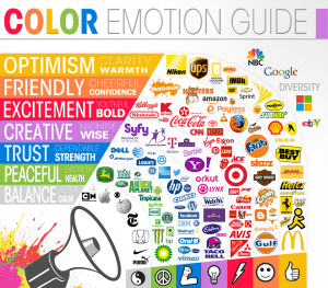
Image Credit: The Logo Company
Here you can take some inspiration from big brands and how they applied the strong power of colour to their logos. Which company resonates with yours?
Fortunately, you can see below a brief description for each color so you can make a great choice about yours!
Primary colours
These are basic colors that can be mixed to produce other colours.
Blue:
It automatically makes you think about nature, because of water and the ocean. This colour projects calm and inner peace like no other, apart from feelings of trust, maturity, and reliability. Blue is highly popular among intellectuals and it’s an appealing colour to the human eye—totally anti-strain material! And after all, who doesn’t like the sea?
Yellow:
This is a particular colour since it can instill positive or negative emotions, according to the shade. If the tone is vibrant, yellow will communicate good vibes and happiness. On the contrary, a dark shade can take the worst out of you, making you feel uneasy and nervous.
Red:
Red is the color of passion; it’s full of energy and it also transmits a sense of urgency. No wonder it’s the colour of so many fast food chains! Moreover, this colour is commonly associated with the medical field, in particular, emergency services, because red is the colour of blood.
Secondary colours
They are obtained from the mixture of primary colours.
Violet:
Violet is the colour of creativity, mysticism, spirituality, and the feminine. Purple can also conjure up images of glamour and luxury. Brands connected to kids and premium food, for instance, use purple. There’s something about royalty going on with this colour, so a lot of beauty products feature violet in their logos and campaigns.
Orange:
Orange triggers certain anxiety levels in people but also, it’s linked to optimism and happiness, like the bright side of yellow. It’s recurrently used to make people buy on impulse.
Green:
This colour, like blue, is closely related to nature. It’s normally featured in the health and environment arenas. A raft of organic products is sold under green visuals, as well as self-improvement activities, such as meditation, yoga, and mindfulness.
And what about multicolour?
Multicolour branding is becoming increasingly trendy (think: JustEat), due to the recent internet expansion. Multicolour projects a fun and easy-going image, apart from multi-skills and new challenges. A lot of giants have chosen this path! I bet you can think of a couple of big brands multi-colouring their logos. Going multi-colour doesn’t mean using colors randomly.
For example, if you sell different products, you can use one colour for each in your blog posts, or maybe you have different Twitter accounts to showcase different services and it’d be totally cool to easily identify them because you used a distinctive color.

Consistency is key
Now that you know what each colour is about, you’re ready to make an immense branding decision: your signature colour. This will be the main colour for your customers to associate with your brand. It’s advisable that you stick to the use of this colour in order to give authority and professionalism to your company. You can use it in the background of your website, your logo, your e-books and to highlight words in your blog posts. Also, you can use emojis of this colour on Instagram, or for your business card (yes, printed business cards still work!)
All your marketing arsenal should look harmonic and in balance, so, if you’re going to choose two colours, let’s say, think beforehand the purpose of each and of course if they match well. Apart from that, you should decide which colour is main and which one is secondary.
Are you about to revamp your logo? Ask clients! Carry out a little survey and find out what’s the best colour or shape choice for the brand. Sometimes things are simpler if you directly ask your customers about it.
If you are still curious about this topic, I invite you to read this article full of data-driven conclusions about the truths and myths of colour in marketing.
Remember that, just as you can’t just show up at a job interview dressing casually or scruffy, you can’t project a professional digital image by a random choice of colours or publications.
Best of luck showing your true colours to the market!
